
WWF mobile site redesign
A group project at General Assembly UX Design Intensive. In this case study, you will be guided through our process to redesign and optimise WWF.sg’s mobile site experience.
-
User and client research, competitive and comparative analysis, research synthesis, wireframing, prototyping usability testing, content strategy, iterations.
Duration: 2 weeks
-
Address user needs and align them with client's goals through a website redesign.
-
Sheralyn, Project management and UX research
Midzi, UXUI designer
Grace, UXUI designer
Jacquelyn, UXUI designer
1 / 4 — Research and discovery

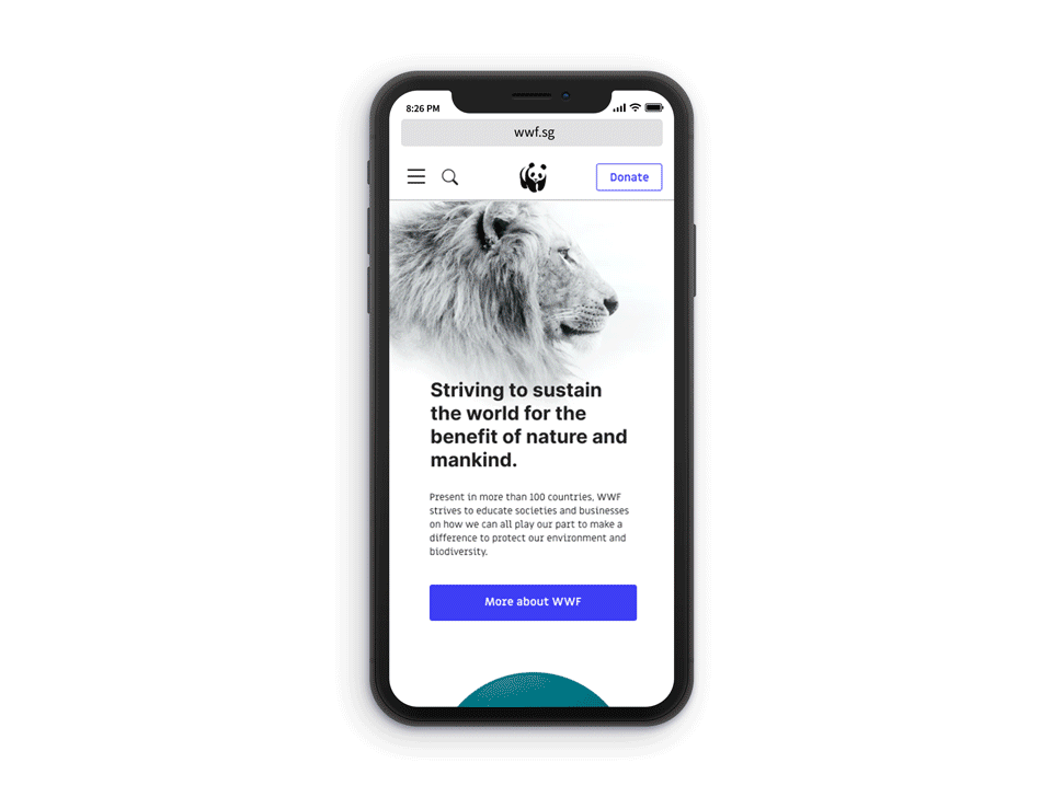
For reference, this is WWF.sg’s current site, on which we did a heuristic analysis and made a list of improvements we can prioritise on.
Getting data
We interviewed users who are environmentalists, or at least significantly care for the environment and its inhabitants, as they are most likely to be visitors of WWF.sg. Quite a few of our users have even been donating to WWF regularly.
Personal goals
All of our users have environmental goals they want to achieve. Many feel that they are not anywhere near their goals.
Different levels
Users’ attitudes towards being environmentally-friendly differ—some are more passionate and active than others.
Mobile first
Most users access WWF.sg with their mobile devices, those who don’t state the high amount of information they have to digest as the reason for accessing the site with a desktop.
Focused concerns
Most users are concerned or focused on one or two environmental issues rather than the whole lot.
Our personas
Penny and Amon are birthed from what we found in user interviews, which gave us patterns and insights of the site’s target users.

“I hope to contribute... but at my own pace.”
Penny the passive
Scenario
Penny has been well-aware about the importance of living an eco-conscious lifestyle but struggles to find the urgency to change her daily habits.
Frustrations
Don’t have the time to read up about environmental issues.
Needs & Goals
To take the first step and better her habits for the sake of the planet and work towards a more sustainable lifestyle

“Nobody can make the change alone. We make each other stronger when we stand together.”
Amon the advocate
Scenario
Amon wants to do more volunteer work. However, he does not want to be bombarded with content that is not relevant to him and he wishes that the process of finding a volunteering opportunity online was more straightforward.
Frustrations
Not being able to find out information to go forward with a volunteering initiative or programme.
Needs & Goals
To consciously lead a more sustainable lifestyle
To be part of a community working together in becoming more sustainable
User flows of the current mobile site
Amon’s current user flow for mobile
Penny’s current user flow for mobile
When we put ourselves in the shoes of Penny and Amon and use the current WWF site like they would, we empathise more with the frustrations they may face when using the site. You can see above that currently their experience on certain areas of the site might not be great. Coupled with a heuristic analysis we did on the website, we’re able to pinpoint areas to start improving things.
Problem statement
Users need a better way to access relevant information on environmental issues that they care about, so that they can make better decisions that aligns with their personal growth.
Our proposed solution
If we improve content strategy and organise categories according to users’ expectations, then we will achieve more engagement because our users will be able to find relevant information specific to their environmental concerns.
2 / 4 — Ideation and definition
We iterate our proposed userflow by improving it based on other good ideas in the design studio session, then select the best one to base our our solution on. Shown below are the best picks created in the design studio.
Penny’s new userflow
Amon’s new userflow
To help navigate the needs of Penny and Amon, we created user flows in which they reach their goals in the shortest, most efficient way possible. To do this, we pick each others’ brains in a design studio to translate our ideas into visuals, and mash up all the good ideas to create the best solutions.
Wireframing
We digitise the sketches and it’s looking more like what the solution will eventually be. The userflow is key to help us chart a path and the wireframes allow us to work visually and plan where design elements or components will go. To improve the way WWF’s content rich site is displayed and perceived, we have to restructure how the content appears.
Investigating the Existing Sitemap
The current sitemap can be improved, along with naming conventions. The menu also has acronyms that readers might not be familiar with (PACT, SASPO).
This is our latest iterated sitemap—advised by our card sorting exercise sent to 30 participants. We have less top-level categories, and the placement of where second-level items live should make more sense to the reader.
Components/UI
With the wireframes and userflow, we’re ready to start looking into creating components and design the interface of the mobile site.
Colour palette and system colours
Typography
3 / 4 — Prototyping and testing
Usability test 1, system usability scale (SUS) score: 75.5
5/5 users:
✓ Managed to learn out more about the environment & how to make little changes to their diet without any errors
✓ Managed to pledge for a WWF cause without any errors
✓ Managed to volunteer for WWF’s activity
Our first usability test (UT) revealed problems that meant fixing it is going to pivot us away from our original proposed designs, and we did just that. For example, we realised we’re forcing our users to make a pledge, a little interaction that WWF.sg uses to help people promise to lead more eco-conscious lives. Our users found the pledge function just fine, but still found it unclear about what pledges are.

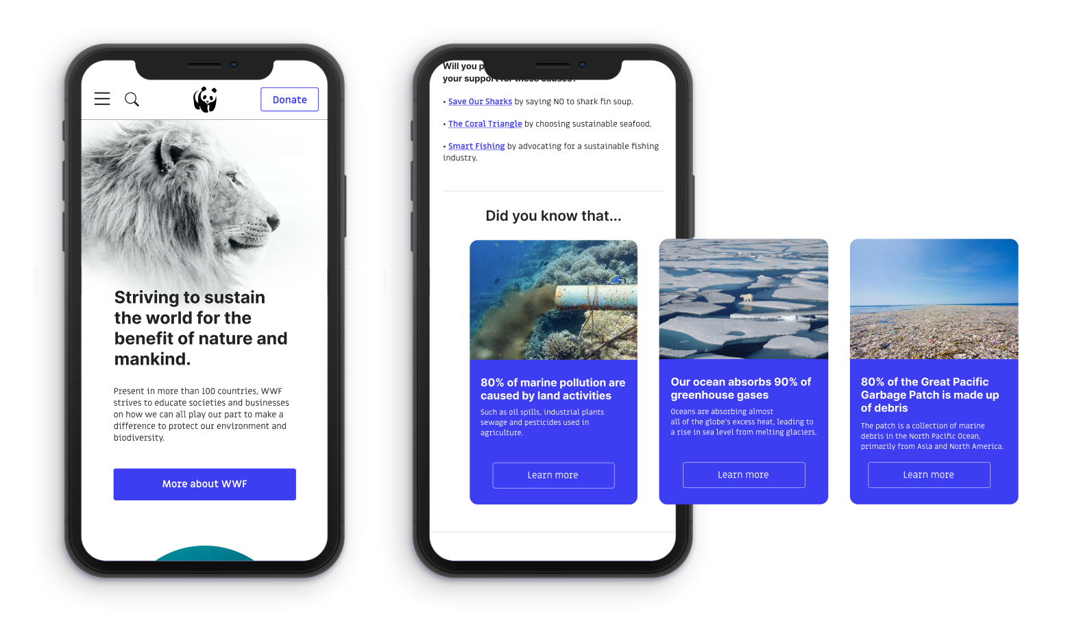
Fig. 1

Fig. 2

Fig. 3
For the second usability test, We decided to scale down the scope of our UT. We also removed the trivia from the front page and framed it as a ‘Did you know’ segment inside a articles with a similar topic. This provides interactivity and quick ways to educate readers on important yet not commonly-known environmental facts. Our redesigned homepage also prioritises environmental concerns rather than making ‘Donate’ and ‘Volunteer’ prominent.
When Penny or Amon browse articles, they will find the related snippets of information, breaking monotony and helping them learn and reach their personal environmental goals.
For the homepage (Fig 1), we realised that our users can’t make a distinction between the two CTA buttons as well as we thought. ‘Take our planet trivia’ also made them think they were about to do a quiz, but it was in fact flash cards with bite-sized info about environmental problems (2, 3). The homepage also greatly emphasised ‘Donate’ and ‘Volunteer’ CTAs. The feedback was that this might seem a little pushy and users would like to know more of WWF first before taking action. Click here to view this homepage design (opens in a new window).
Usability test 2, system usability scale (SUS) score: 86
5/5 users:
✓ Managed to learn out more about a specific environmental issue
✓ Managed to volunteer for WWF’s activities
Picture above: an example of the ‘Did You Know’ segment as swipable cards in related articles.
4 / 4 — Solution, delivery and beyond
The cycle of improving and learning never ends. The priority is to design solutions to help our target audience reach their goals better and faster. In conclusion, our solution features:
Improved information architecture to help users navigate content
Focused environmental concerns where we organise environmental issues into broad categories
Refurbished homepage featuring specific environmental concerns
Easily digestible learning content (e.g. key takeaways of articles, mini-quizzes, Did You Know segments)
Our next steps include
Designing and structuring the rest of the pages such as the shop, annual reports page, pledges and so on.
Interviewing a different group of people: business entities or representatives, who want to be more environmentally friendly, or commit to a CSR programme, as WWF has CSR opportunities as well.
Creating a desktop version with more interactivity.
Test, iterate, rinse and repeat.

Focused environmental concerns for Penny and Amon to find the issue they want to learn more about efficiently.
Example of learning content that is casual and easy to take up.
Feel free to check out our Figma prototype (designed for mobile, but also accessible on desktop).
Experience the latest prototype →

Wrapping up
We faced a tight timeline so we have to be wise with how we set our scope, and stick to the priorities we’ve set.
That was a lesson that was rather poignant. Planning was so important to set the pace and provide a clear picture of our schedules and tasks. Another lesson learnt was making sure that everyone is on the same page which means absolute transparency and upkeep in documentation and communication, especially when we’re working from home.