
01 - Overview
Dr Presence (doctor-facing app): Supporting the GP’s next decision
“Could we do follow up visits remotely and reliably?”
Three general practitioners (GPs) in Singapore wanted to support chronic-condition follow-ups with readings collected at home. The opportunity was to help doctors review those readings before deciding what follow-up was needed. The GPs have built a doctor-facing and a patient-facing app, but needed designers to improve the usability and visual design.
Over six weeks in January 2021, I teamed up with three other designers to take on this project. We were at the end of our UX design intensive training course and had the opportunity to work on a client case. Our team performed tasks for both apps: product audit, user research, usability tests, iterative wireframing and prototyping. I worked on both apps, and created their design systems.
This abridged story of the doctor-facing app follows one GP reviewing seven days of measurements of Pauline, his patient with hypertension.
02 - Audit
UX audit of the original build
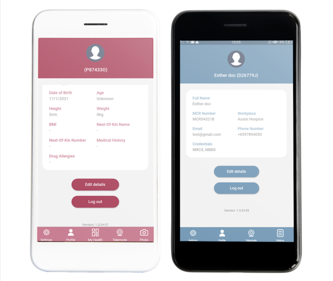
Key frictions identified
The requirements are that the product only exchanged measurements, from the patient app to the doctor app. It would not be possible to make calls with the apps, any verbal communication between the doctor and patient would have to happen outside of the app. However, the interface suggested a live teleconsultation with the button “Telemode” on the navigation bar.
We performed a heuristic analysis and found that usability in general of the two apps measured poorly, due to the following issues:
- A misunderstanding that the app performed active teleconsulting in “telemode”, when the main capability was actually for simply receiving health measurements. There is no call function possible.
- The lack of system feedback and error prevention
- Lack of design and typographical hierarchy
- Usage of technical and medical jargon
- Buttons too small and close to each other, increasing the chances of misclicks
- Contrast issues, font sizes too small
03 - Research
Going back to the drawing board
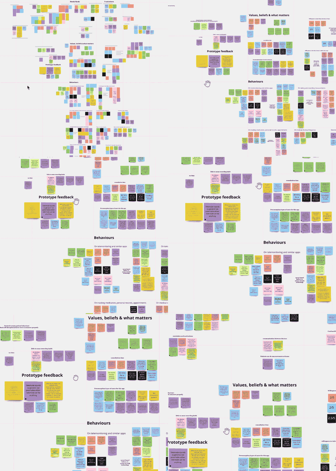
We interviewed seven doctors and eight patients, and examined how people used the existing apps. Home readings were often kept in notebooks or phone notes. Doctors saw potential for remote follow-ups when clinically appropriate.
The design direction: give readings context
- A submission needed to connect to the patient’s record and medication history. Usability feedback on the prototype reinforced the need to see medication and other measurements alongside the readings.
- That shaped the review experience: make new submissions visible, keep patient context close and support comparison over time.
Work with the existing care workflow
We clarified the handoff between the patient app, doctor app and a phone call: patients and doctors communicate mainly via calls, but the data transmissions happened from the patient app to the doctor app. The product supported remote follow up visits to ensure clarity and track patterns on the patients’ health data.
- Patient phones the GP for the scheduled review
- Patient shares home readings through the app
- GP opens the patient record and reviews the readings
- GP discusses the next steps by phone


04 - Design
A scheduled review with Pauline
Pauline has a scheduled hypertension follow-up. This illustrative scenario shows how the design supports her GP from an incoming submission to a discussion about medication use.
Review visits should still feel the same
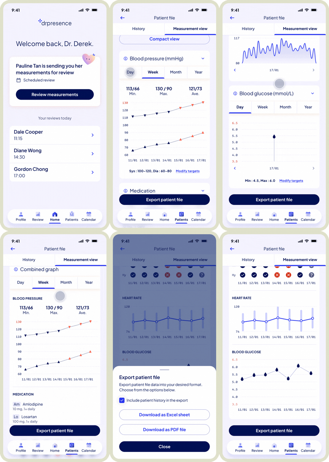
Pauline sends her measurements at a scheduled time and date, not unlike her weekly visits to the clinic. This still maintains a sense of familiarity of the reviews for both parties. The dashboard highlights her entry and offers the GP a direct route to review. As the visits are scheduled in advance, the GP would be able to expect them at a certain date and time.
Keep the patient’s context in the picture
Pauline’s record and measurements sit in the same patient file. The GP can check her condition and previous reviews before interpreting the latest readings.
Compare trends without losing meaning
Alongside the blood-pressure trend, Pauline’s medication log shows two reported missed doses. “Not logged” remains a separate state, so missing data does not become a clinical assumption.
The GP remains in control
Pauline’s records give the GP the full picture and a reason to ask, rather than an explanation on their own. In this scenario, the GP discusses the entries with Pauline by phone and advises her to continue medication as prescribed.
Each review records modifications to medications and measurement targets
The patient file contains a list of reviews that have occurred in the past or are scheduled, which act as a record of the changes made to medication and certain measurement targets. Any review with a modification is marked with the respective icon. This allows a potentially long list to be scannable if the GP needs to look for a specific review where modifications were applied.
05 - Conclusion
A clearer way to track remote follow-up visits
The doctor app connected incoming readings, patient context and history into a focused review workflow. The patient app allows the patient to record and send measurements remotely. For the service to work, it was imperative for our design to ensure that data transferred from the patient app is reliable, and the data collected on the doctor app is presented in a way that’s meaningful, to help the GP uncover insights about the patient’s health data.
Engagement with the client ended after delivery: findings in the audit, insights gained from the user research and usability test, revised prototypes for both apps and design systems. A next validation round would test interpretation accuracy, review time and whether the data visualisation of patients’ submissions provides meaningful information to aid in decision making.